Delivering exceptional presentations can substantially improve your ability to differentiate your architecture or engineering firm from your competitors. Of course, the content of your presentation, how you sell your firm's talent and expertise to prospective clients for a specific project, is the key.
There is no doubt, however, that an engaging presentation also goes a long way in winning that next job. And an important component of a winning presentation is nothing less than a high-quality design. Consider the following ten design tips to enhance your next project presentation, and help your firm stand out in the crowd.
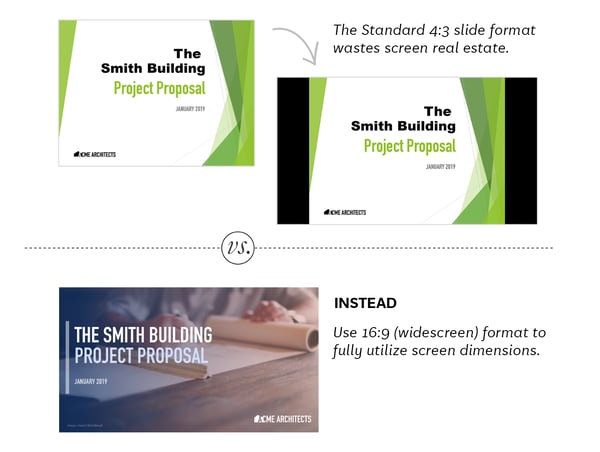
1. Make sure the slide dimensions are Widescreen 16:9 and not Standard 4:3.
Slides created in Standard 4:3 are nearly square and when presented will not fill the entire screen. The better ratio to use is 16:9, which fills the laptop screen, and allows for space on each slide for columns of text and imagery.
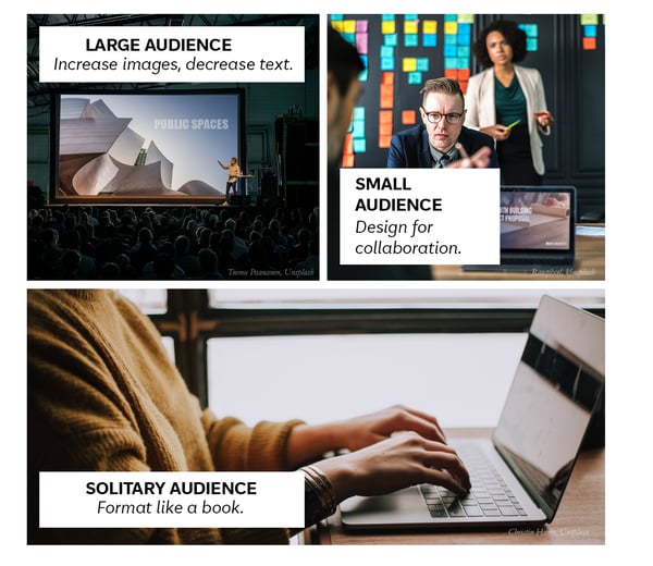
2. Tailor the presentation to your audience.
Your presentation should be created for the size of your audience and the setting in which it will be presented.
If you are presenting to a larger audience in an auditorium, you will want to increase the use of illustrative graphics and imagery, and decrease the use of paragraphs of explanatory text instead, as your audience will be listening to you speak rather than privately reading. If the auditorium is dark, it is important to avoid white backgrounds.
If your presentation is a pitch in a conference room, it is okay to have more explanatory text included on your slides as those meetings tend to be more collaborative with interruptions, i.e., questions and reactions, from your audience.
If your presentation is intended to be a self-guided document, the format should be closer to that of a magazine, as you are not there to present. And so, you should use legible paragraphs of text and supporting imagery, scaled to be read well on a laptop.
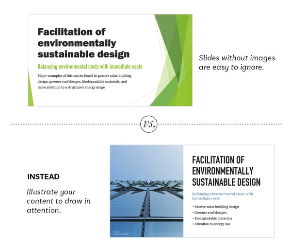
3. Make slides as graphic as possible.
Appealing photographs and illustrations often say what paragraphs of text cannot. Audiences can feel overwhelmed by too much text on a slide and tune out.
Keep the presentation fresh and engaging by illustrating your concepts and incorporating large photographs on most slides. Beautiful copyright-free photographs can be found at Unsplash.com.
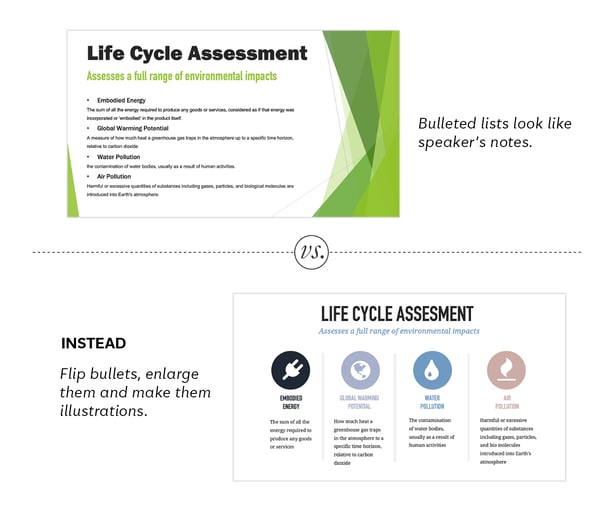
 4. Illustrate bullet points.
Presentation layout templates suggest each slide be structured in a series of bullet points. These make for dull visuals and are best left for the unseen speaker’s notes.
However, bullet points are sometimes the best way to show a list. Rather than create a text heavy slide, break the bullet points into columns and illustrate each point with an icon.
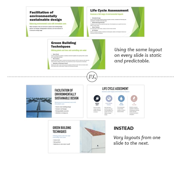
5. Vary the layout from slide to slide.
Maintaining the same layout from slide to slide is static and predictable, and this can encourage your audience to tune out. As a general rule, it is best to change the position of text and graphics from slide to slide.
If text is on the left side of one slide, swap its position to the right on the next, or use a different layout altogether. Change layouts from slide to slide unless the second slide is a continuation of the same thought of the first.
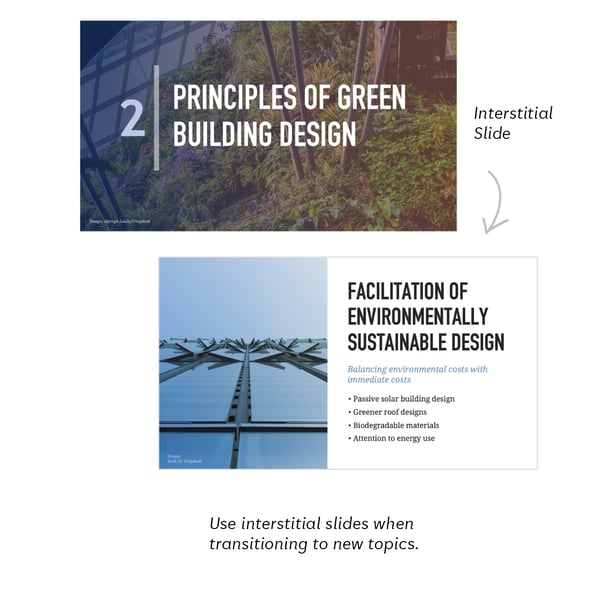
 6. Use interstitial slides to introduce new topics.
Interstitial slides are title slides for new sections, like chapter markers in a book. They give the audience a small break and a chance to adapt to shifting topics. Make yours colorful, graphic or photographic, and number them so the audience stays organized with the presentation progression.
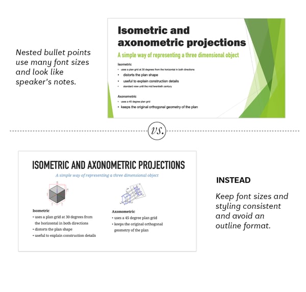
7. Be consistent with fonts and font sizes.
As mentioned in #4, presentation software suggests that you create each slide as a series of nested bullet points, with fonts shrinking as the nesting deepens. This outline form makes for dull slides. Think of each slide more as a layout and less as notes. Maintain the same styles for titles, body text and captions across all slides.
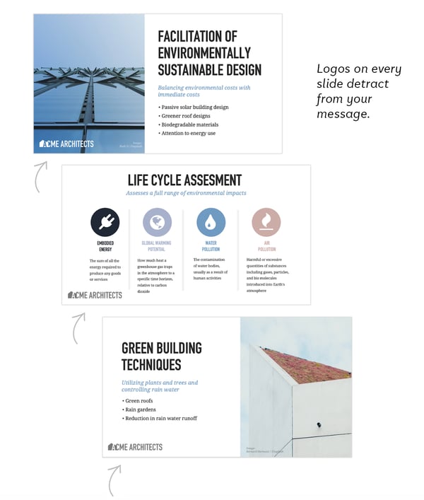
 8. Brand your slides thoughtfully.
Just as a network logo placed in the lower corner of a television show distracts from a story, a company logo placed on every slide can distract from your message. Logos take up valuable space, prevent graphics from making an impact, and make for static visuals. Only add a logo to slides if there truly is a good reason for it to be there.
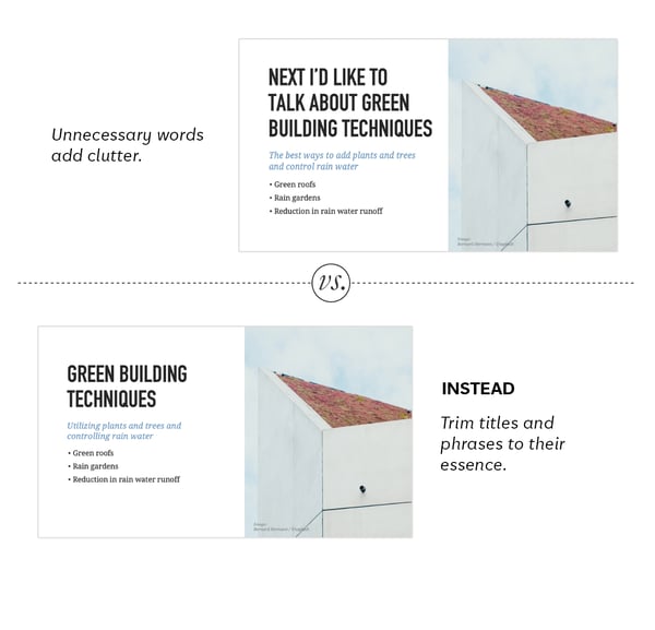
9. Cut extra words.
Can your titles and text be more to the point, hold more power, and be more direct? Wherever possible trim away passive phrases and conversational language, all which weaken a message and add unnecessary visual clutter.
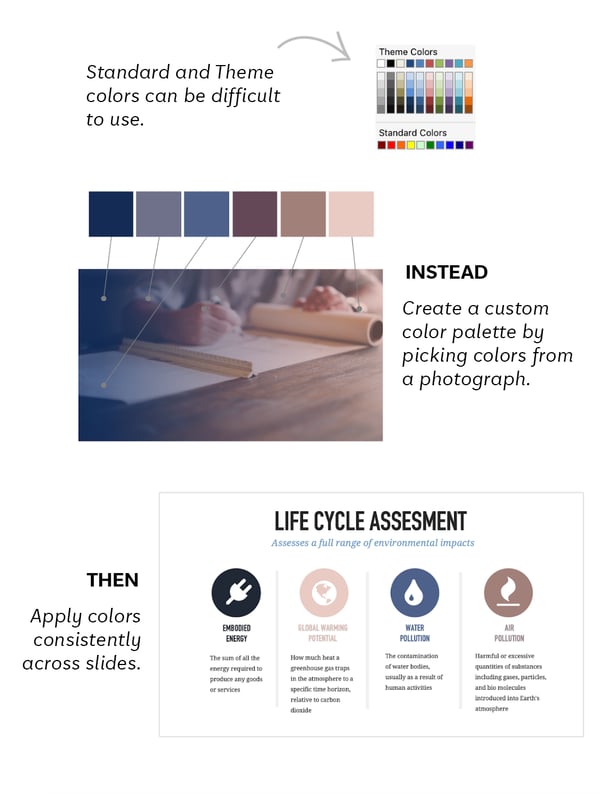
 10. Define a custom color palette.
The default colors presented in presentation software are difficult to work with. They are either too saturated or too similar. A great way to make your presentation looks designer is to create your own palette of six colors by picking them from a title slide photograph and then use them consistently in your presentation.
Here is a video that shows you how to create your own color palette.
These 10 Tips and Tricks are from Slide Therapy, a series of custom-designed presentation software templates that give you everything you need, from guidance to templates, to make a truly designer presentation.
ABOUT SLIDE THERAPY
Slide Therapy is a series of master PowerPoint decks that make it quick and easy to pull together a glossy, well-designed presentation for large, small and solitary audiences.
This system uses a PowerPoint file to contain both a series of slide templates and a book of tips and tricks.
Created by a tech designer, these templates and tricks allow people of any field to communicate clearly, look polished, and spend less time making their presentation.
PSMJ is always looking to publish diverse views on issues and trends in the A/E/C industry. We invite you to submit a 500-word post on any industry-related topic. We look forward to hearing from you.